How-to guide
Customising store branding
Set your logo, colours, banners and visual elements.
Your branding is how customers recognise your store: your logo, colours, font, menu, footer and the banners on your home page. You set all of it in Design in your Ordrio admin panel, and it shows on your website and in your app.
Before you start
- Have your logo ready as a picture file of up to 1 MB. A small square version works best for the browser tab icon (also up to 1 MB).
- Have your banner pictures ready, up to 5 MB each. The best size for a full-width banner on a computer is 2560 × 650.
The screenshots below use example values, such as the banner name "Weekend offer" and the category "Beverages". Use your own colours, pictures, names and categories.
Open Design
- Open nadi.ordrio.com (your Ordrio admin panel) and log in.
- In the left menu, under Design & Communication, click Design.
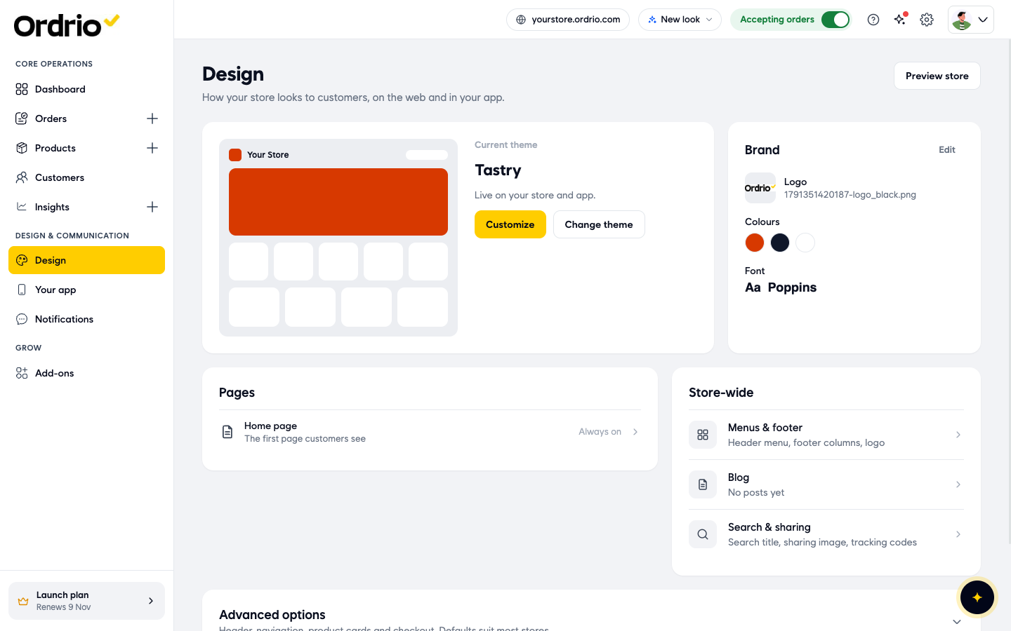
The Design page shows your Current theme, your Brand (logo, colours and font), your Pages and the Store-wide settings, such as Menus & footer, Blog and Search & sharing. Preview store opens your store in a new tab.
Set your colours and font
- In the Brand box, click Edit. The Colours & font screen opens, with a preview of your store on the left.
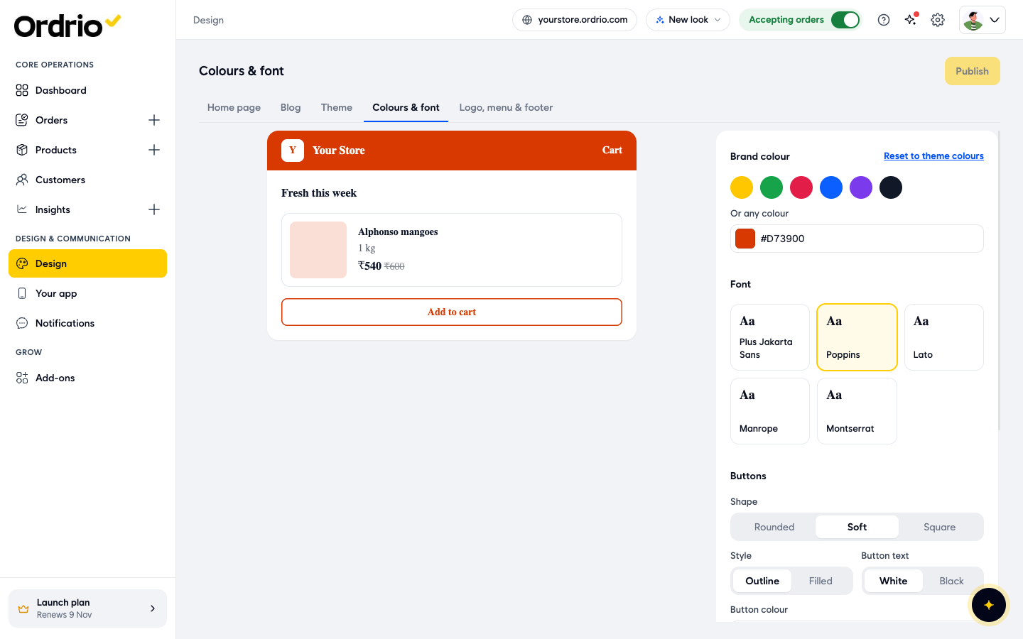
- Under Brand colour, click one of the six colours (Yellow, Green, Red, Blue, Purple or Ink), or type your own colour code in Or any colour, for example #16A34A. The preview changes straight away, and Discard and Publish appear at the top.
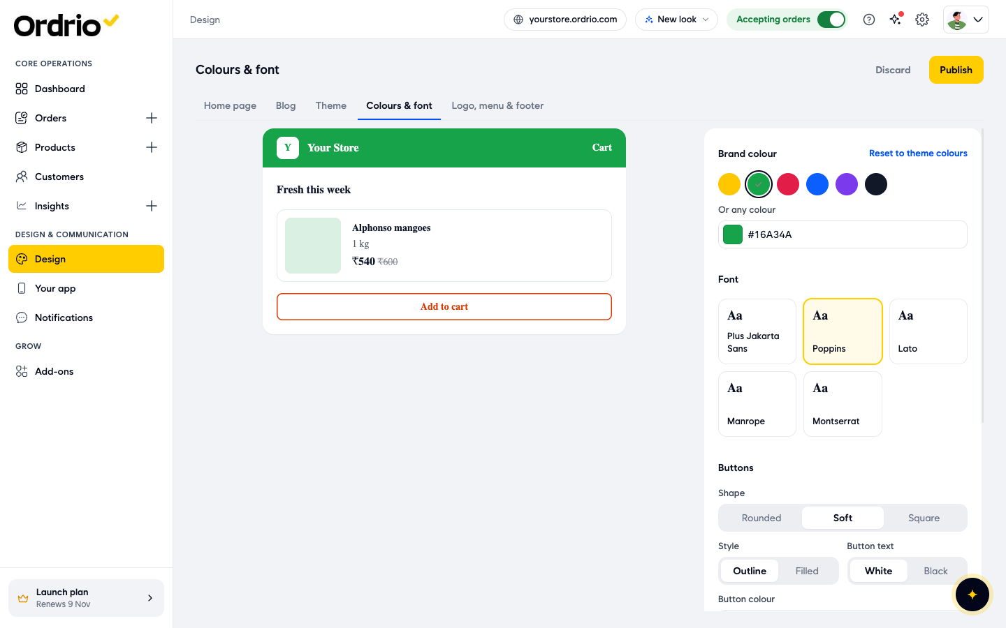
- Under Font, click the font for your store: Plus Jakarta Sans, Poppins, Lato, Manrope or Montserrat.
- Under Buttons, pick a Shape: Rounded, Soft or Square.
- Pick a button Style: Outline (a coloured border) or Filled (a solid colour).
- Pick the Button text colour: White or Black.
- Type a Button colour code. The button colour is set on its own, so it does not change when you change your brand colour.
- Under Page colours, set the Text colour, the Page background colour and the colour of the Lines between sections.
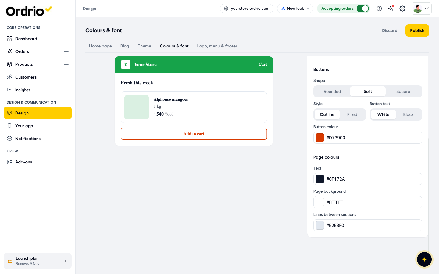
- Click Publish. Your new colours and font go live on your store, and the Publish button greys out until you make another change.
Changed your mind before publishing? Click Discard. To go back to the colours your theme came with, click Reset to theme colours.
Add your logo and browser tab icon
- Click the Logo, menu & footer tab at the top of the screen.
- Under Logo and icon, next to Logo, click Replace.
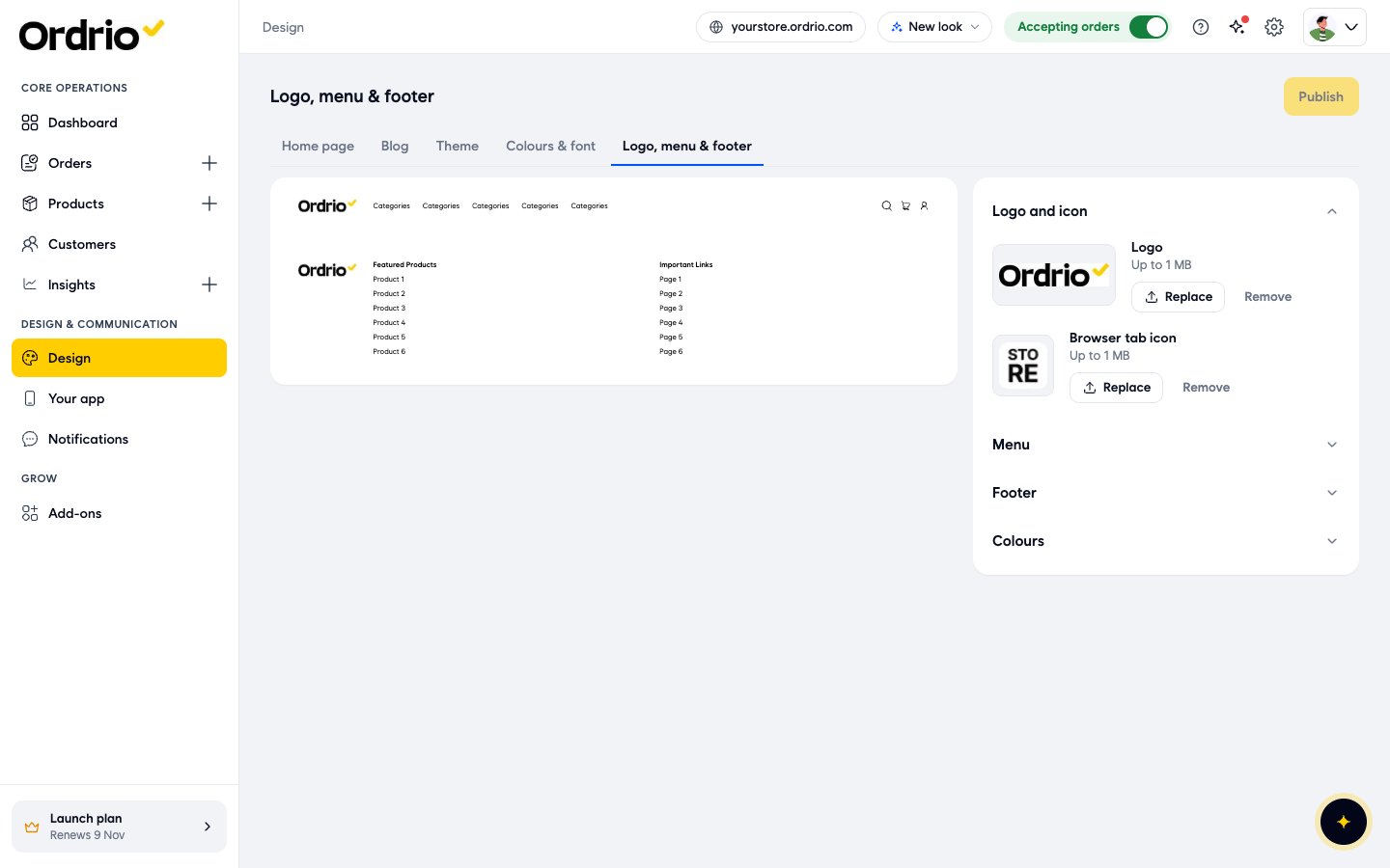
- In Choose a picture, click your logo in your media library, or click Upload to add a new file (up to 1 MB).
- Click Use this to confirm your picture.
- Next to Browser tab icon, click Replace and pick your icon the same way. This is the small picture customers see on the browser tab next to your store's name.
- Click Publish.
To take a picture off, click Remove next to it.
Set your header menu
- On the same tab, click Menu. You see the links in your store's header menu.
- Click Edit next to a link. The Edit menu link window opens.
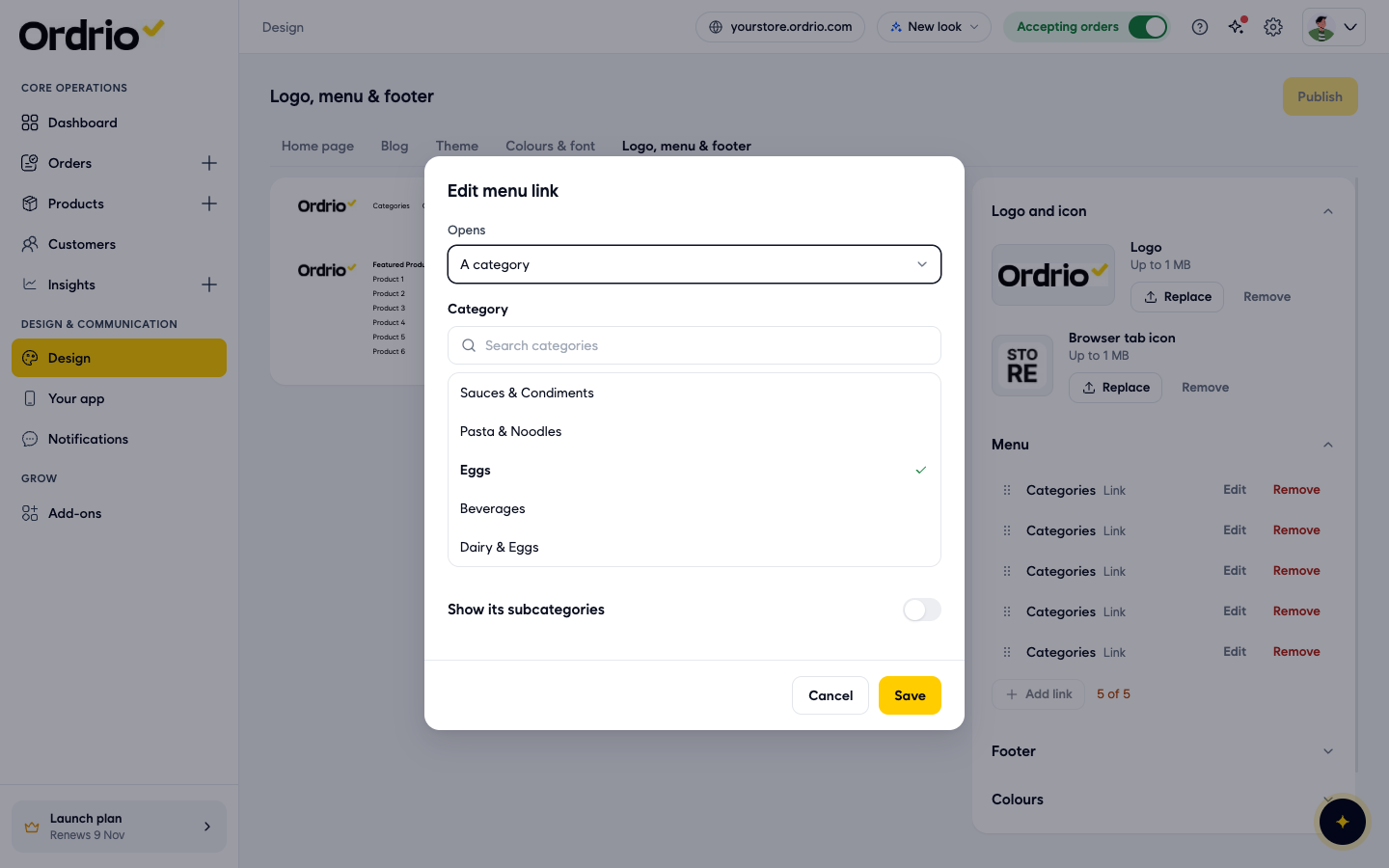
- Under Opens, choose what the link opens: A category, A product, A brand, Your own link, The blog (all posts) or One blog post.
- If you chose a category, search for it under Category and click it.
- Turn on Show its subcategories if you want the menu to show the category's subcategories too.
- Click Save.
To add a link, click Add link. To delete one, click Remove. To change the order, drag a link by the dots on its left.
Set your footer
- Click Footer. You see your footer columns, for example Featured Products and Important Links.
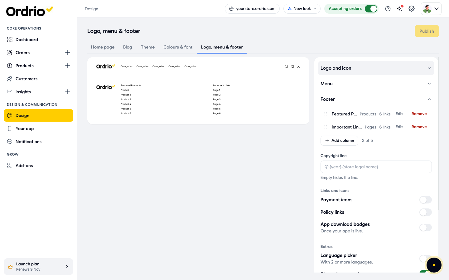
- Click Edit next to a column to change it, or click Add column to add a new one.
- In Copyright line, type the line shown at the bottom of your store. Leave it empty to hide the line.
- Under Links and icons, turn on what you want to show: Payment icons, Policy links and App download badges (these show once your app is live).
- Under Extras, turn on the Language picker (it shows when your store has 2 or more languages), the Store phone number and a Back to top button.
- Leave Show the footer on phones on to show the footer on phones, or turn it off to hide it there.
Give your header and footer their own colours (optional)
By default, your header and footer use your theme colours.
- Click Colours.
- Turn on Custom header and footer colours.
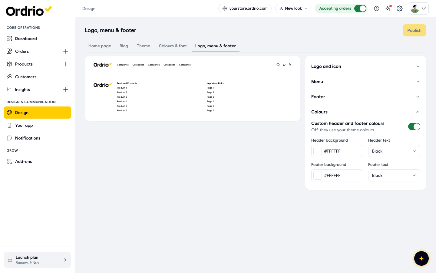
- Type a Header background colour code.
- In Header text, pick a text colour, for example Black or White. Theme text colour uses your theme's text colour.
- Type a Footer background colour code.
- In Footer text, pick a text colour.
- Click Publish.
Add a banner to your home page
- Click the Home page tab. The page editor opens, with your Sections on the left, a preview in the middle and the settings on the right. Use Desktop and Mobile at the top to see the page on a computer or a phone.
- In Sections, click your banner, for example Banner 1. Its settings open on the right.
- In Name (optional), type a name that helps you find this section, for example "Weekend offer". Only you see this name.
- Under Where it shows, pick Top of page or Between sections.
- In Display, pick a layout: Full width · 1 or more pictures, Rectangle, medium · 2 or more pictures, Rectangle, small · 3 or more pictures or Thin strip · 1 or more pictures.
- Click Computer to set the pictures shown on computers. Later, click Phone to set the pictures shown on phones.
- Under Picture 1, click Change picture.
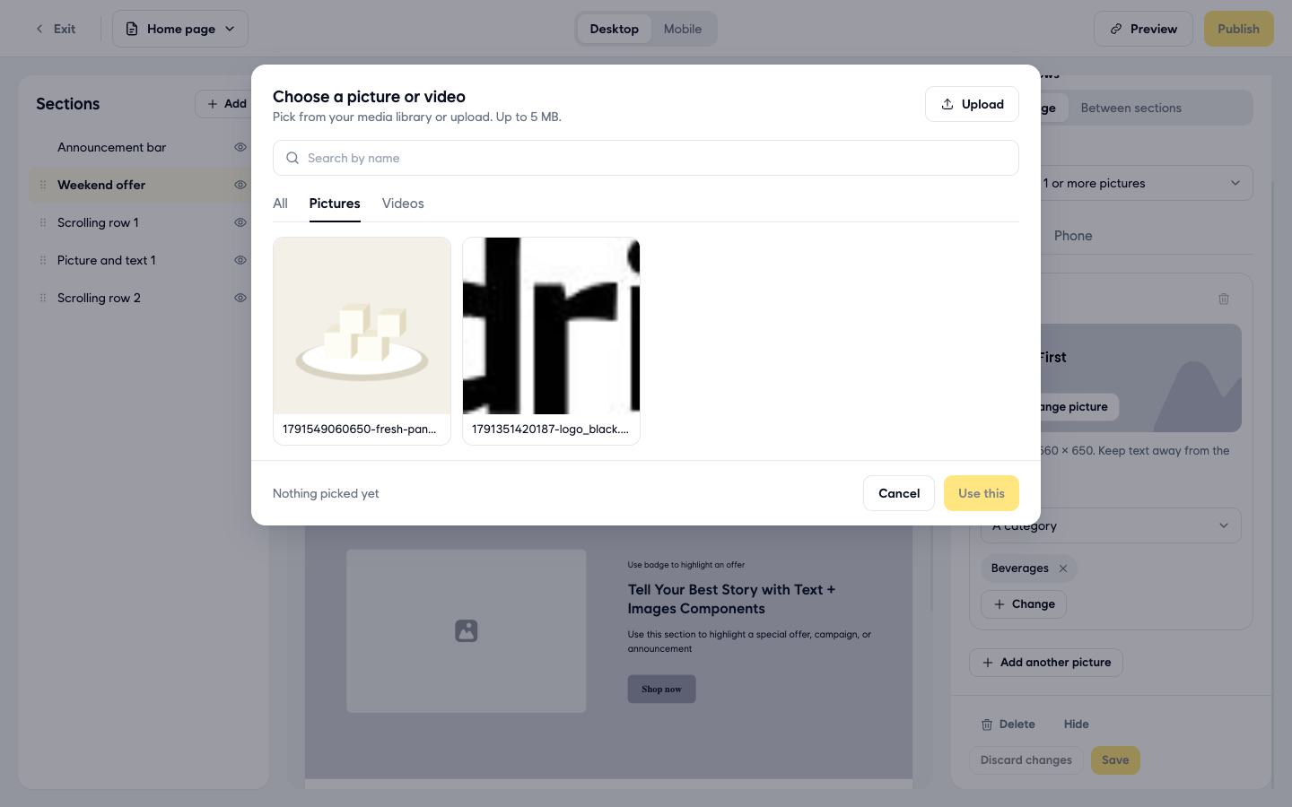
- Click a picture in your media library, or click Upload to add a new one (up to 5 MB).
- Click Use this.
- Under Opens, choose where the banner takes customers when they tap it: A web link, Products, A category or A brand.
- If you chose A web link, type the address in Web address. If you chose a category, click Choose a category, type at least 2 letters of its name, tick it and click Done. Until you pick something, the banner is not clickable.
- To show more pictures in the same banner, click Add another picture and repeat steps 7 to 11.
- Click Save. The section now shows the name you gave it in the Sections list.
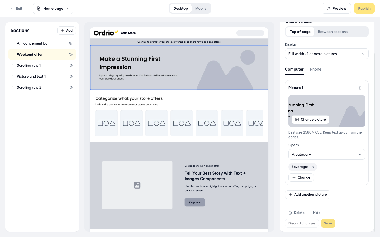
- If Publish at the top right is active, click it to put your changes live.
- Click Preview to see your home page in a new tab.
To hide a section without deleting it, click the eye icon next to it in Sections, or click Hide at the bottom of its settings. Delete removes it. To add a new section, click Add next to Sections.
Change your theme (optional)
Your theme sets the overall layout of your store.
- Click the Theme tab. Your theme is marked Current.
- Click Website or App at the top to see how themes look on each.
- Click a theme to preview it. Paid themes are marked Paid and show Subscribe to theme in the preview.
Your products and settings stay the same when you switch themes.
Good to know
- Your branding shows on both your website and your customer app.
- Logos and browser tab icons can be up to 1 MB. Banner pictures and videos can be up to 5 MB.
- For a full-width banner, the best picture size is 2560 × 650. Keep text away from the edges so it is not cut off on smaller screens.
- Your header menu can have up to 5 links, and your footer up to 5 columns. When you reach the limit, Add link or Add column greys out.
- On the Home page tab, save or discard your changes to a section before you move sections around.
- Advanced options at the bottom of the Design page let you change the header, navigation, product cards and checkout. The defaults suit most stores.
- Your app's name, icon and splash screen are set in Your app, not in Design.
- The search title and the picture shown when someone shares your store link are in Search & sharing.
Related
- Recommended setup order for new stores
- Choosing and applying a theme
- Adding your first product